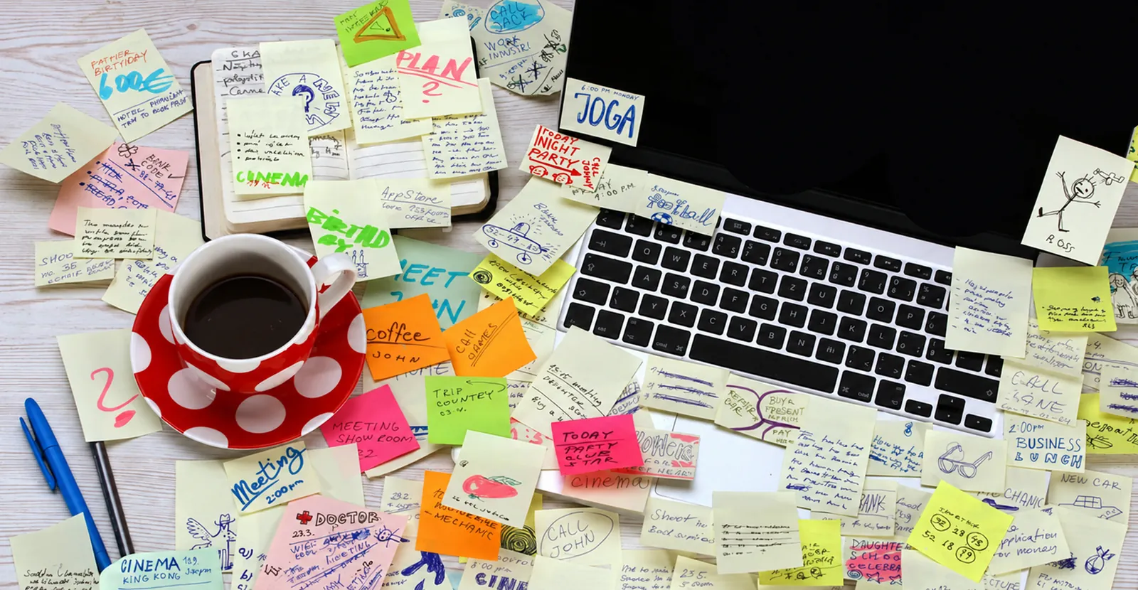
Tagiio: Fixing Digital Notetaking
What would a notes app look like if it were built for the things people email to themselves?
- Client
- Tagiio
- Outcome
- App Store launchSuccessful funding round
- Role
- Freelance Creative Director
- Responsibilities led
- Competitive reviewFormative researchProduct framingVisual identity and UI kitInteraction design
Overview
Tagiio is an early-stage startup building tools for collaborating and sharing information. Its first product is a notetaking app that stands out for its collaboration features and clean, straightforward design.
I worked directly with the founders as a freelance creative director, from the first whiteboard sketches to launch and a successful funding round.
Finding the gap
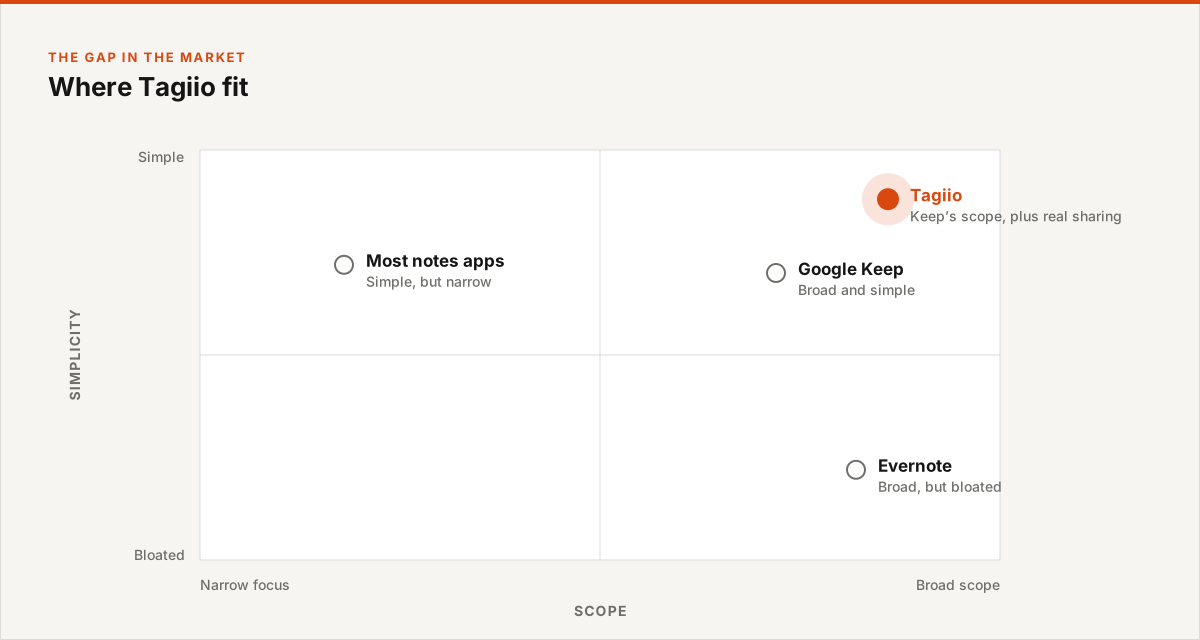
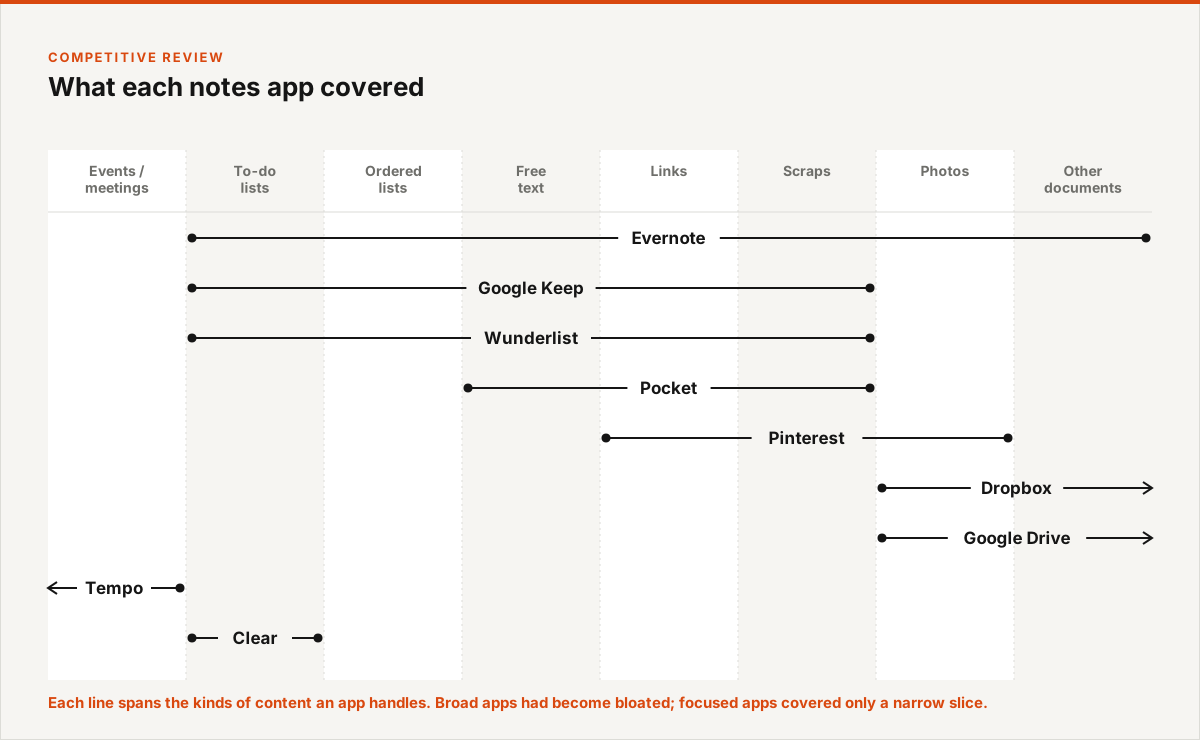
The founders sensed that the potential of mobile notetaking wasn’t being realized. A competitive review showed why: most apps had a very narrow focus, while Evernote had a broad one but had become bloated. The founders envisioned something with the scope of Google Keep and much stronger sharing.
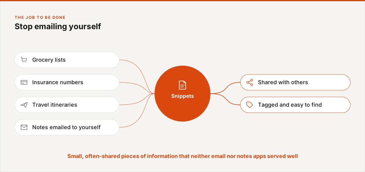
The job to be done: stop emailing yourself
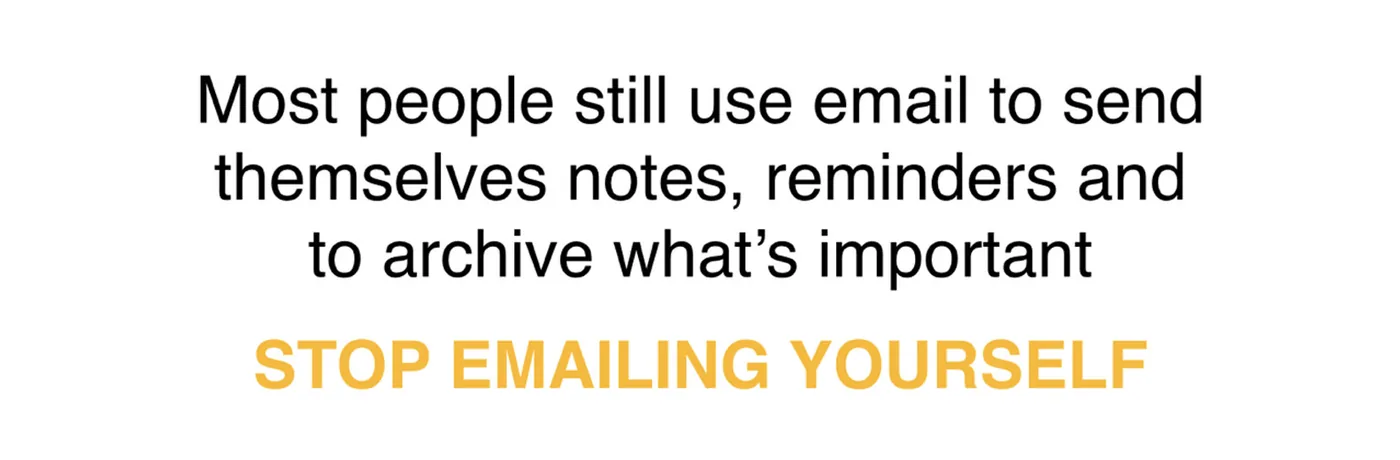
Formative research showed people regularly emailing themselves bits of information that would have been better kept as notes. Using Clay Christensen’s jobs-to-be-done framework, we framed the product’s job simply: stop emailing yourself.
Snippets
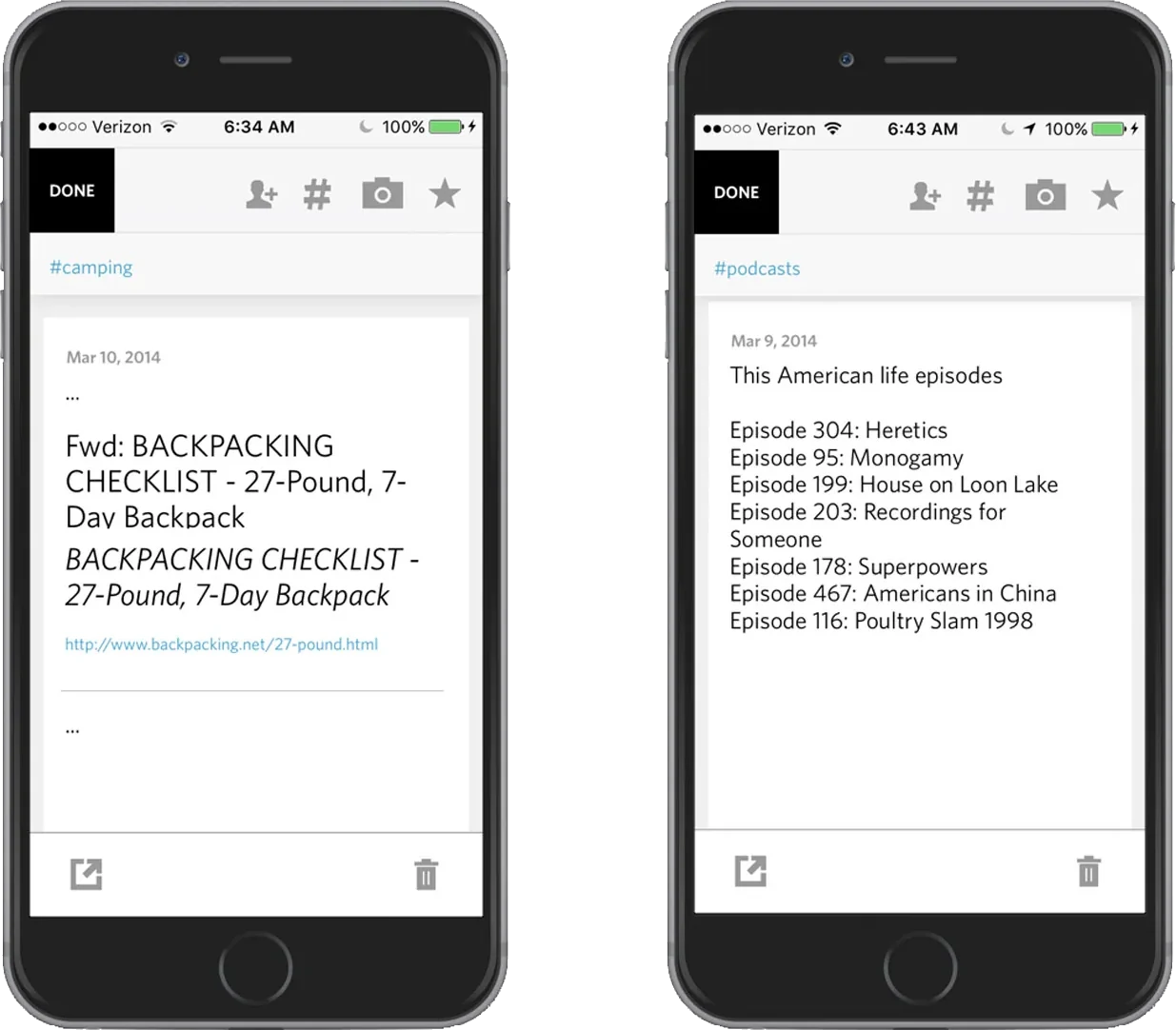
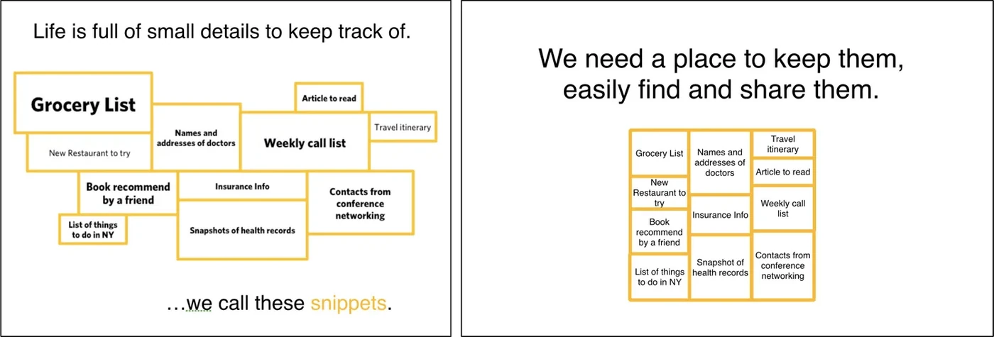
We also found a class of information that neither email nor notes apps served well, which we called snippets: grocery lists, insurance numbers, travel itineraries. Snippets are often shared between people, which made sharing central to the product.
A quiet visual identity
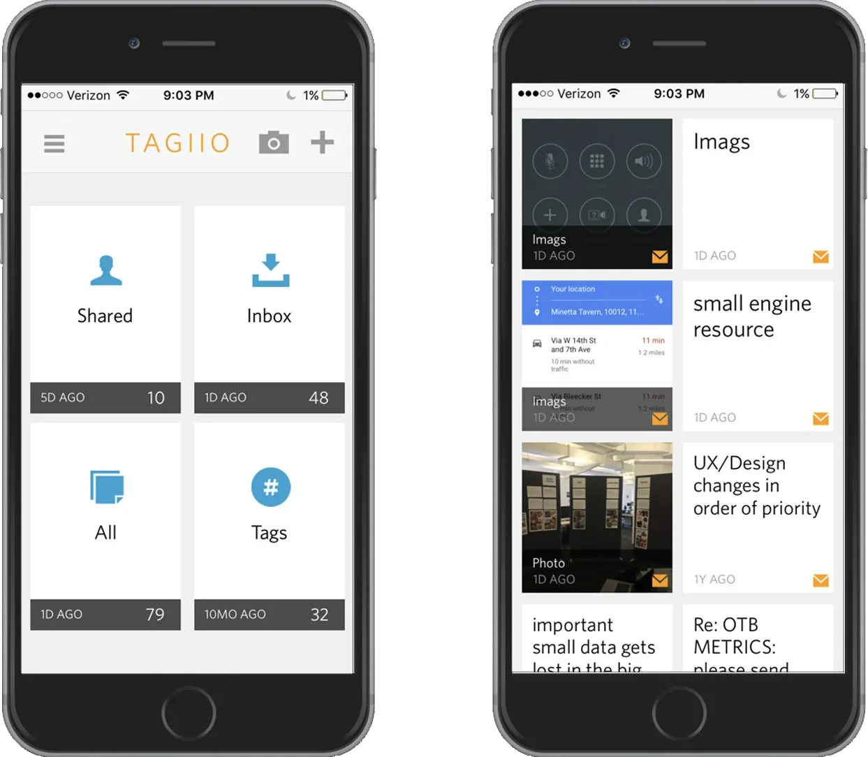
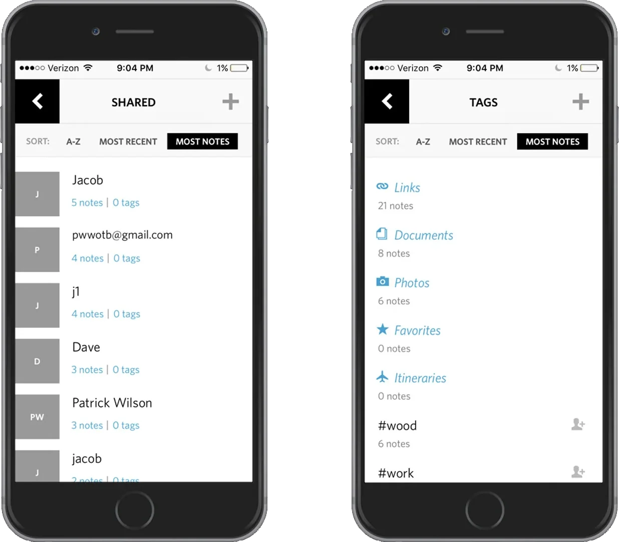
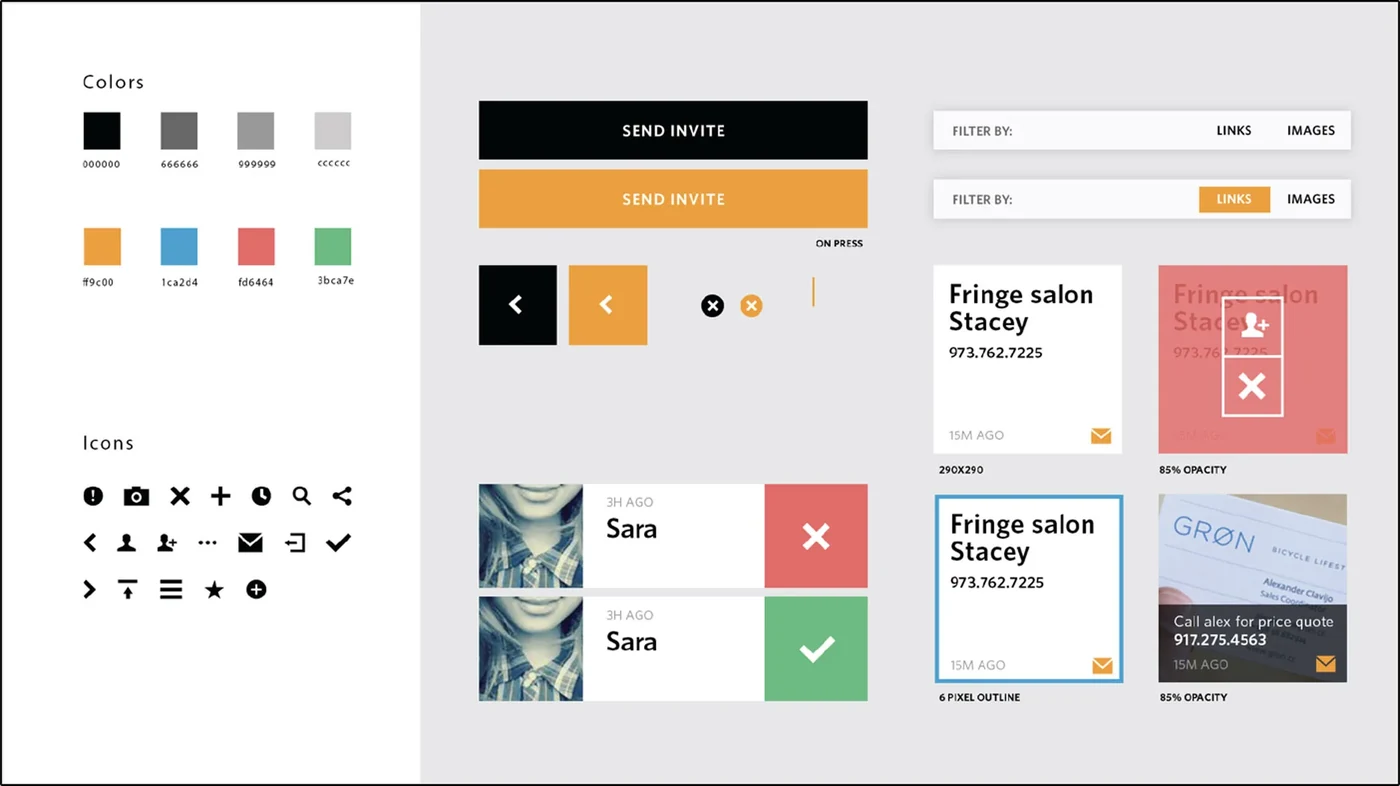
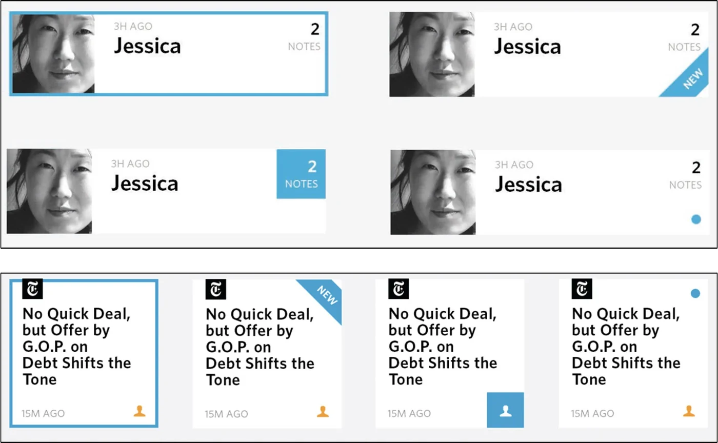
Where most apps of the time had busy, heavy identities, we developed a simple, flat UI kit, then refined key details such as the indicator for a newly shared note.
Key views
The landing screen immediately reveals the core idea: notes have four key views. The grid gives each note as rich a preview as possible, an innovation in displaying notes at the time.