
Zagat
Helping People Find a Restaurant Before They Know What to Search For
Zagat’s Local Search Experience
Case Study · 5 min read
Outcomes
A New Search Model Reduced the Work Required to Find a Restaurant
Google adopted the search strategy and its progressively assisted “happiest flows” in the final product.
The redesigned Zagat iOS app was subsequently shipped.
By 2015, Zagat occupied an uncomfortable position. Google had acquired the company four years earlier to strengthen its local-review content, but the broader Google+ strategy had faltered and other sources of local information had emerged. Meanwhile, competitors had developed increasingly capable restaurant-discovery products.
Google decided to reinvest in Zagat, renew its brand identity, and rebuild its outdated iOS app as a competitive local-search product. The new app would not be constrained by the structure or interaction model of the product it replaced.
LEADING EXPERIENCE STRATEGY AND DESIGN
I led experience strategy and design for the new Zagat iOS app during a six-month engagement in 2015.
I joined at the beginning of the initiative to synthesize existing research, define product recommendations, and align stakeholders around a core experience strategy. I then led a cross-functional design sprint with Product and Engineering and managed a UX designer and visual designer through delivery of the final product.
DESIGNING A NEW PRODUCT FOR A BRAND IN TRANSITION
The project needed to solve several problems simultaneously:
Zagat had to reestablish its relevance in a crowded restaurant-discovery market.
The existing app was no longer a credible foundation for the new product.
The experience needed to work for people with a specific restaurant in mind and for people who only knew that they wanted somewhere to eat.
The redesign also needed to preserve the distinctive assets people still valued: Zagat’s ratings, editorial perspective, curated lists, and recognizable authority.
The opportunity was not simply to modernize an outdated interface. It was to determine what role Zagat could play in the moment between wanting to go out and feeling confident about a choice.
THE SEARCH MODEL ASSUMED TOO MUCH OF THE USER
Conventional search begins by asking people to articulate what they want. Restaurant discovery often begins much earlier.
A person might know that they are hungry, that they want somewhere nearby, or that they are looking for dinner—but not yet know the restaurant, neighborhood, or cuisine they want to enter into a search field.
Existing research also identified typing as a significant point of friction in mobile search. Requiring a fully formed query placed the greatest burden on users at the moment when their preferences were least defined.
The central challenge became:
How might Zagat help people begin discovering restaurants before requiring them to know exactly what to type?
Goals
Reduce the work required to begin. Use context and common behavior to offer useful starting points without waiting for a typed query.
Support different levels of intent. Create an experience for people who wanted immediate recommendations, people who preferred to browse, and people arriving with a specific search in mind.
Make frequent actions easier to reach. Allow actual usage patterns—not the legacy feature inventory—to determine the interface hierarchy.
Build confidence in the final choice. Combine ratings, editorial judgment, imagery, community reviews, and practical information into a coherent decision experience.
BUILDING DISCOVERY AROUND THE DECISIONS PEOPLE ACTUALLY MAKE
We designed a progressive search model that introduced effort only when it became necessary. The first path anticipated likely needs using context and frequency. The second allowed people to browse popular searches from a familiar search screen. The third assisted users who already knew what they wanted to type. This created three “happiest flows”: increasingly explicit paths that supported different levels of intent without forcing every user through the same interaction.
Process
Research and synthesis: reviewing existing local-search research and product usage data.
Strategy: identifying the behaviors and product assets that should determine the new experience.
Ideation: aligning Product, Engineering, and Design through a cross-functional design sprint.
Prioritization: emphasizing features according to frequency of use and value to the core journey.
Design: developing the primary search flows and the supporting discovery and decision experiences.
Evaluation and refinement: identifying where people accepted contextual assistance and where they still expected familiar controls.
RESEARCH: FINDING THE BEHAVIORS BENEATH THE FEATURE LIST
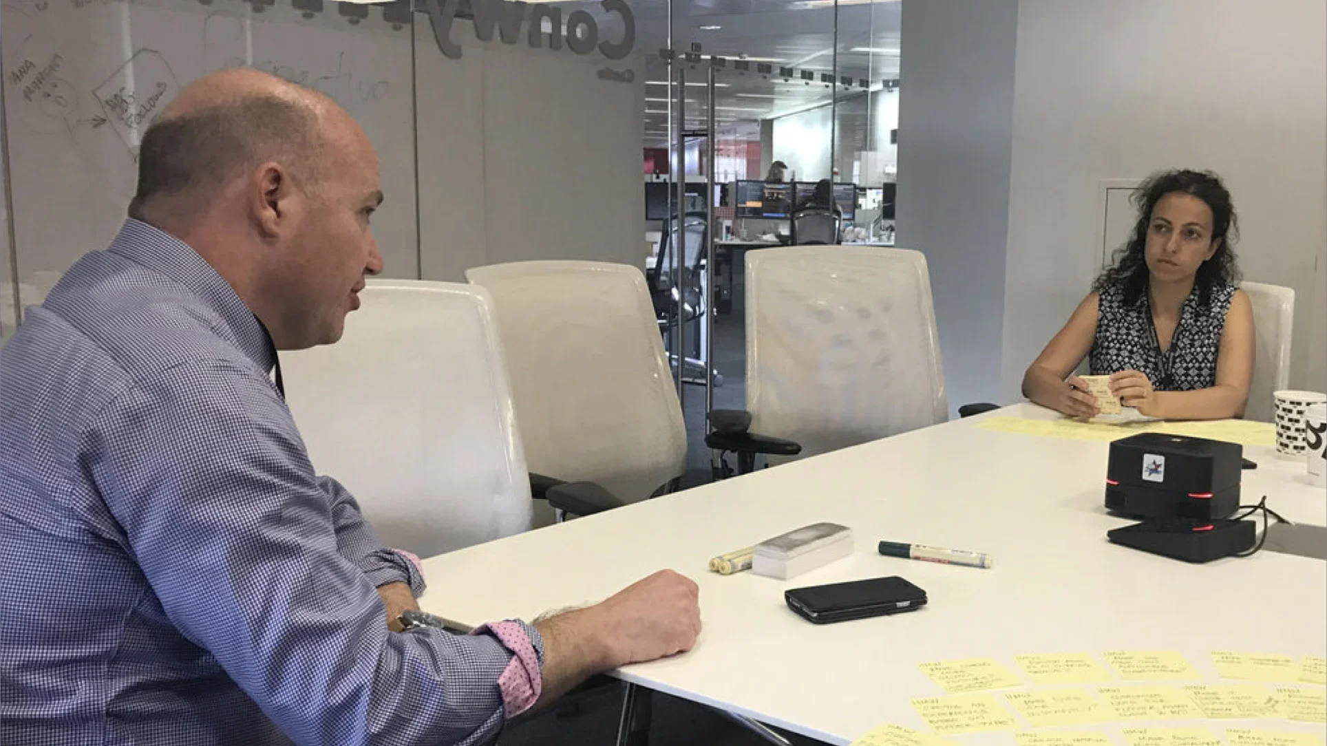
I began by reviewing existing research about local search and examining usage logs for search and filtering in the existing app.
The data helped us distinguish between features that occupied space in the product and behaviors that genuinely mattered to users. It also revealed which searches and filters occurred frequently enough to become visible starting points in the new experience.
This established a practical design principle:
The interface should make the most common and useful actions easiest to reach.
IDEATION: ALIGNING THE TEAM AROUND A NEW SEARCH MODEL
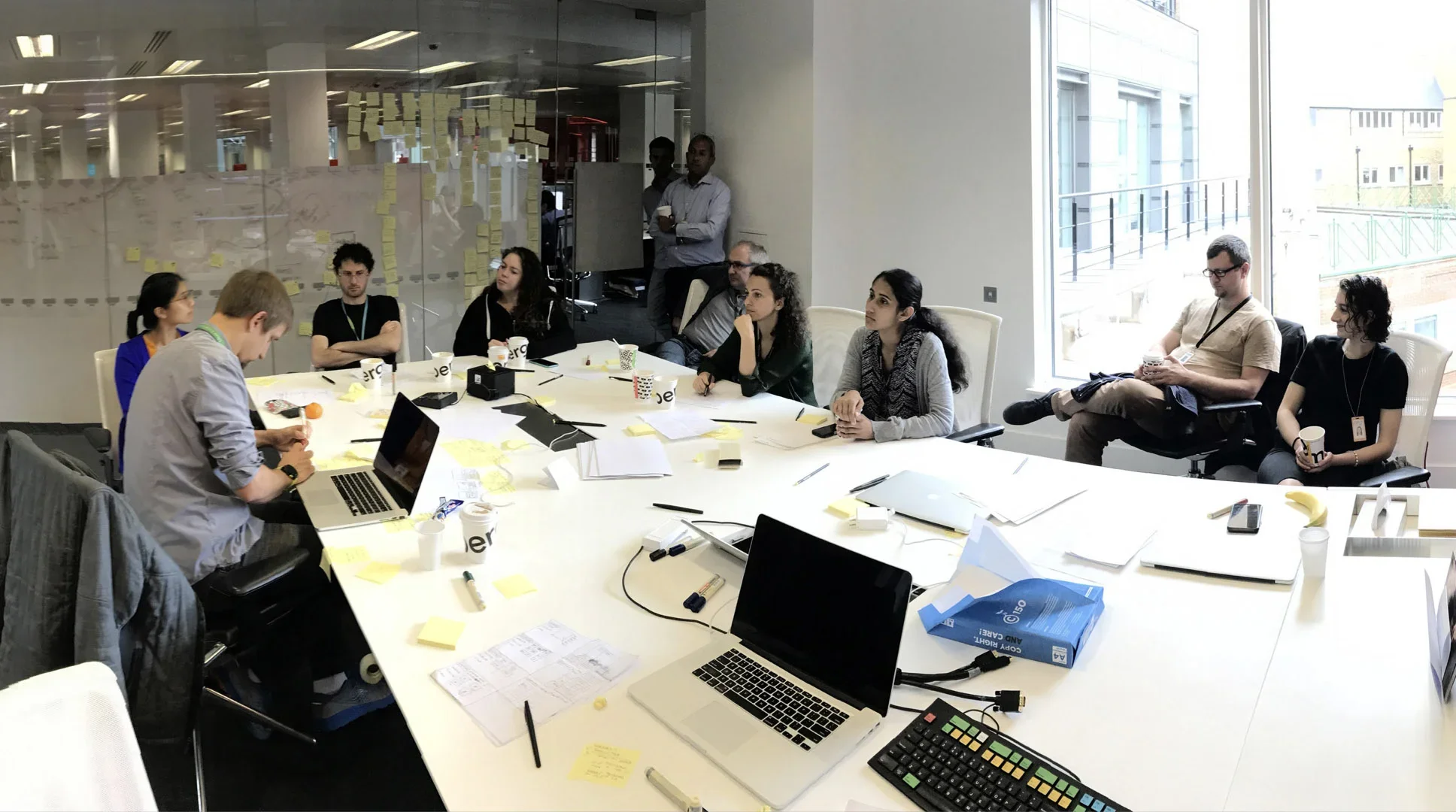
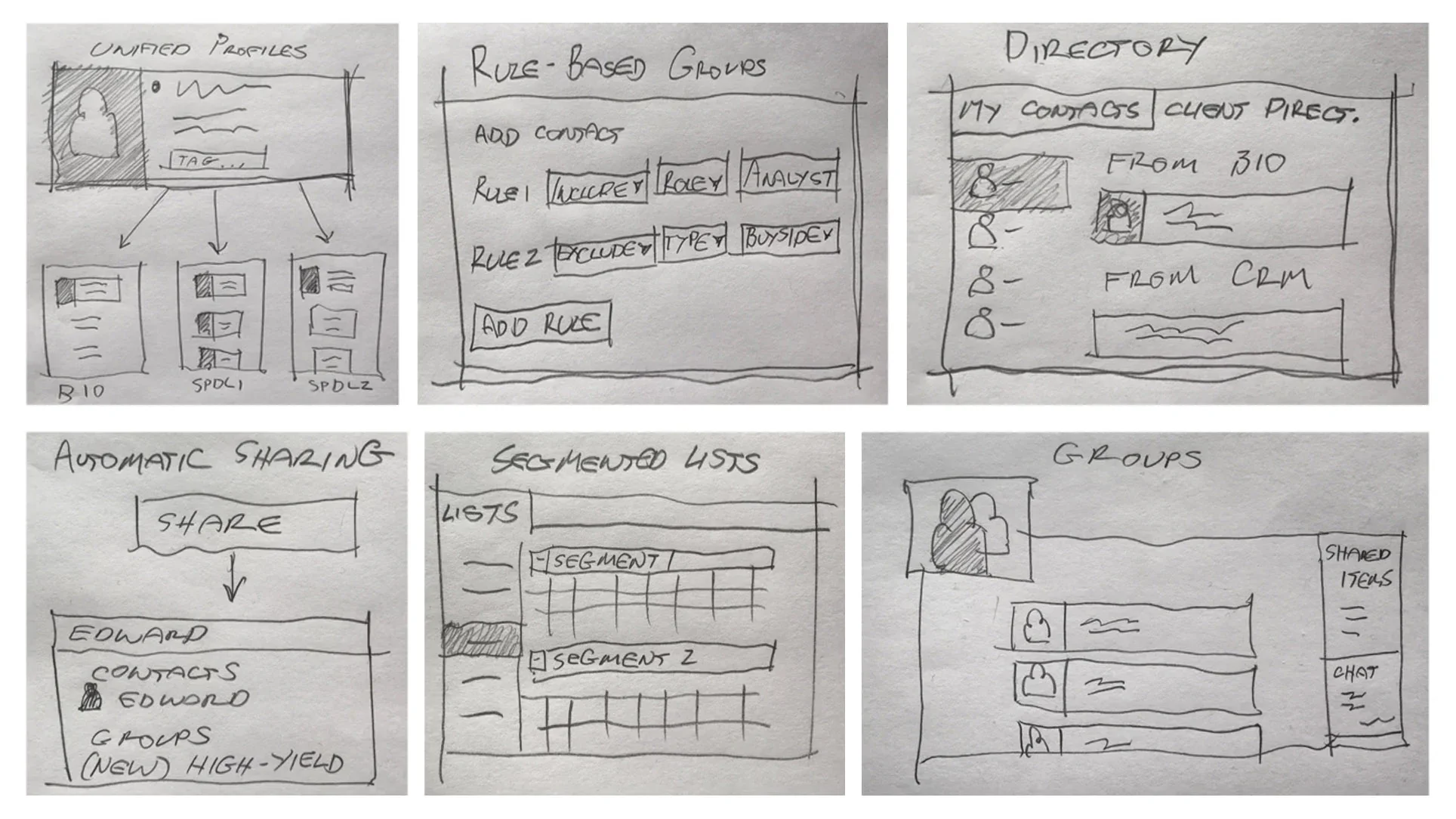
I led a Google Ventures–style design sprint with Product and Engineering to translate the research into a shared product direction.
The sprint allowed the team to move beyond individual feature requests and consider the complete journey: recognizing a need, beginning a search, exploring possibilities, and developing enough confidence to choose a restaurant.
The result was not simply a collection of interface concepts. It was alignment around a more useful role for Zagat: helping people move from an open-ended desire to a confident decision.
PRIORITIZATION: LETTING FREQUENCY SHAPE THE EXPERIENCE
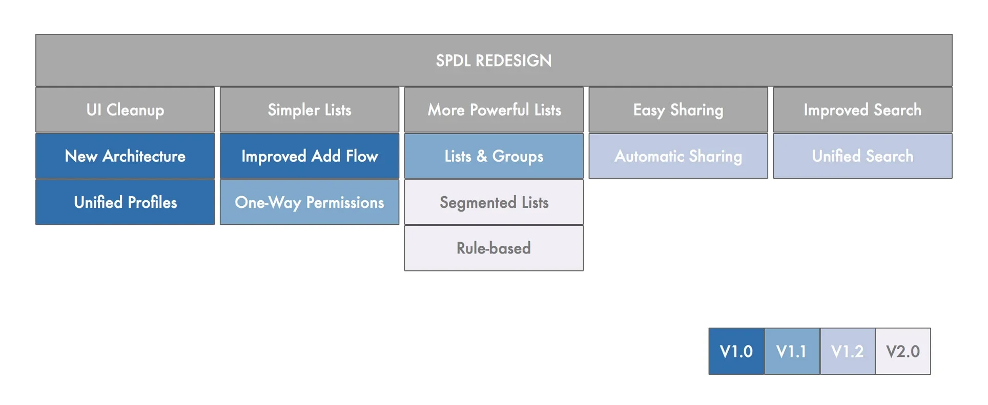
Usage patterns gave us a basis for deciding what the interface should emphasize.
Frequent searches could become contextual recommendations. Popular cuisines could become immediately available filters. Less common actions could remain accessible without competing with the primary journey.
This allowed the product to feel simpler without becoming less capable. We did not remove complexity indiscriminately; we organized it according to how often and when people needed it.
DESIGN: PROGRESSIVELY ASSISTING THE SEARCH
The final model supported three starting conditions:
A user who wanted the product to make a useful suggestion.
A user who wanted to browse before deciding.
A user who already knew what to enter.
Rather than treating one behavior as correct, the experience provided each user with an appropriate level of assistance.
THE HAPPIEST FLOW: BEGINNING WITHOUT TYPING
The ideal flow required no typing.
The home screen suggested frequent searches using signals such as time of day and location. A single tap opened relevant results on a map, where commonly used cuisine filters were immediately available.
The flow allowed users to begin with a likely need, see nearby possibilities, and refine the results in as little as two taps.
The product was no longer waiting passively for a query. It was helping the user take the first step.
THE SECOND HAPPIEST FLOW: MAKING BROWSING FEEL FAMILIAR
Early evaluation showed that some users were hesitant to initiate a search from recommendations on the home screen. They expected to begin from a recognizable search interface even when they had not yet formed a query.
The search screen therefore presented frequently performed searches, ordered according to popularity in the user’s current location.
This preserved a familiar starting point while still reducing the need to formulate and type a request.
THE THIRD HAPPIEST FLOW: ASSISTING SPECIFIC INTENT
Some users arrived knowing exactly what they wanted and expected to use a conventional search field.
For them, we designed autosuggest menus that progressively narrowed the possibilities as they typed. This reduced effort without obstructing users who had already formed a specific intention.
Typing remained available, but it became the third level of assistance rather than the price of entry.
LISTS: PRESERVING A DISTINCTIVE FORM OF DISCOVERY
Zagat’s curated lists were a valued and recognizable part of the brand.
Rather than burying them inside search, we retained Lists as a primary navigation destination. They supported a different discovery behavior: browsing through an editorial point of view rather than beginning with a query or filter.
This allowed the redesigned product to modernize its interaction model without discarding one of Zagat’s most distinctive strengths.
SAVED: SUPPORTING DECISIONS THAT HAPPEN OVER TIME
Research identified a group of users who browsed restaurants before they were ready to make an immediate choice.
The Saved experience allowed people to bookmark both individual places and complete lists. This extended Zagat beyond the immediate search session and supported the gradual way people often collect possibilities for future plans.
PLACE DETAIL: BUILDING CONFIDENCE IN THE CHOICE
Finding a possible restaurant did not complete the user’s decision. People still needed to determine whether it was the right choice.
The place-detail experience combined photographs, ratings, expert reviews, community reviews, and practical information into a deliberate sequence. As users moved through the page, they encountered different forms of evidence rather than a single undifferentiated database record.
The page was designed to answer the question beneath the search:
Is this where I want to go?
REFINING THE MODEL: PRESERVING CONTROL WHILE REDUCING EFFORT
The design did not assume that every user would welcome prediction or begin in the same way.
When evaluation showed hesitation around home-screen recommendations, we did not abandon the strategy. We added a familiar search-screen path that offered the same underlying assistance in a form some users found easier to trust.
The resulting experience balanced two needs: helping people decide with less effort and preserving their sense of control over the search.
IMPACT: THE SEARCH STRATEGY BECAME THE SHIPPED PRODUCT
Google adopted the progressively assisted search model and the three “happiest flows” in the final Zagat experience.
The project moved from research and strategy through cross-functional alignment, detailed UX and visual design, and product delivery. The redesigned iOS app was subsequently released.
Although I no longer have the original performance reporting, the clearest outcome is concrete: the central experience strategy was accepted, developed, and brought to market.
REFLECTION: THE BEST SEARCH SOMETIMES BEGINS BEFORE THE QUERY
The project changed the starting assumption of the experience.
Instead of treating search as a field waiting to be completed, we treated it as a progression from uncertain desire to confident choice. Context, frequency, editorial judgment, and interface design could help users move through that progression without requiring them to articulate everything at the beginning.
The “happiest flows” were not attempts to eliminate choice. They were ways of matching the amount of effort required to the amount of intent a person already possessed.
That remains important to how I approach product strategy: strong experiences do not merely make existing tasks more efficient. They recognize the work users are not yet able—or should not need—to do for themselves.