BLOOMBERG
Simplifying Collaboration Across the Bloomberg Terminal
Bloomberg's Collaboration Products
Case Study · 5 min read
Outcomes
Users Strongly Preferred a Simpler Experience That Preserved Their Core Workflows
In comparative testing, NPS increased from approximately 65 to more than 80.
The redesign was subsequently shipped.
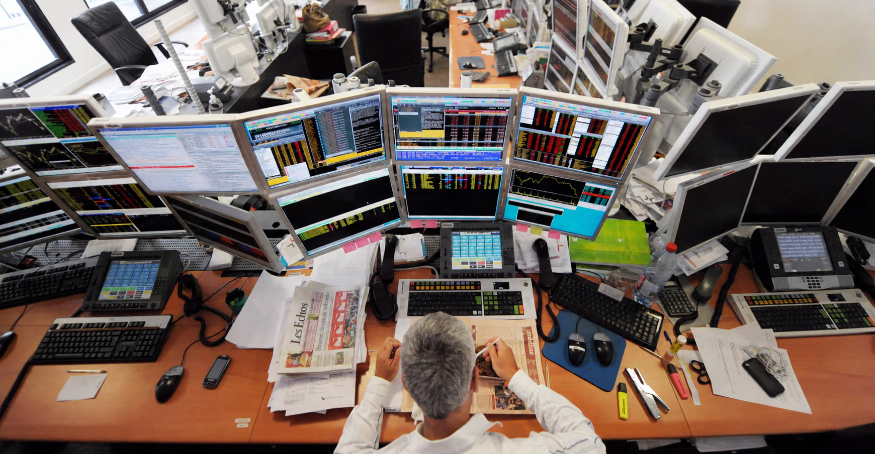
Over twenty-five years, the Bloomberg Terminal evolved from an information service into a critical collaboration environment. Messaging, contacts, groups, directories, and workflow tools were added incrementally to meet immediate needs. Each addition delivered value, but the accumulation produced an experience that was increasingly inconsistent, difficult to navigate, and costly to extend.
Leading UX Across Product, Engineering, and Design
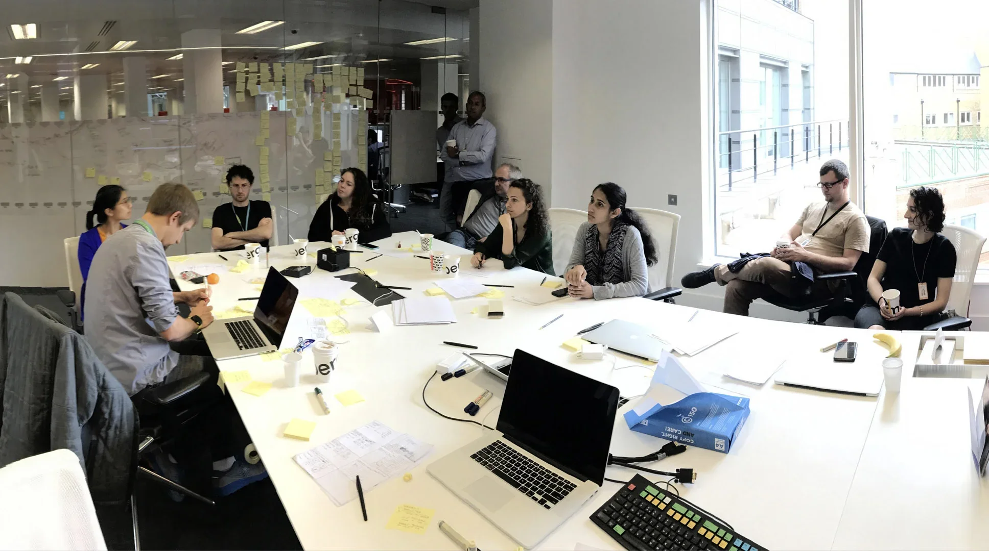
I helped lead the Collaboration UX team across nine flagship applications, working with Product and Engineering to simplify workflows while respecting the speed, reliability, and learned behaviors on which financial professionals depended. This case study focuses on SPDL, Bloomberg’s Contacts application—an essential tool whose underlying model no longer reflected the work users were asking it to support.
Designing for Precision Within Hard Constraints
Designing for the Bloomberg Terminal meant working inside an unusually constrained interface system:
The front-end technology allowed limited visual and interaction flexibility.
The system used a single typeface and fixed row heights.
The color palette was intentionally limited and high-contrast.
These constraints removed many of the tools designers typically use to signal hierarchy or simplify an experience visually. Good design therefore depended less on surface expression and more on precision:
Understanding real workflows
Clarifying information architecture
Reducing unnecessary steps
Preserving the conventions that helped expert users move quickly
The limitation was also useful. It forced us to distinguish decoration from value. Every proposed change had to earn its place through a clearer workflow, a more understandable model, or a better decision for the user.
The Product Model No Longer Matched the Work
SPDL began as a contact-management application but expanded as users requested groups, sharing, permissions, and other capabilities. Over time, people began repurposing features—particularly groups—to perform work the product had never been designed to support.
The challenge was not merely to simplify a complicated interface. It was to reconsider how SPDL represented people, lists, permissions, provenance, and relationship context without disrupting the speed and learned behaviors of expert users.
Goals
Make the Contacts application simple again. Reduce unnecessary complexity while protecting the speed and functionality that made SPDL valuable.
Support the work users were actually doing. Provide the capabilities people needed so they no longer had to repurpose the groups feature as a workaround.
Create a scalable foundation. Develop a coherent interface and information model that could grow without repeating the fragmentation of the legacy product.
These goals gave us a shared standard for evaluating ideas. A feature was not valuable merely because someone requested it; it needed to make an important workflow clearer, more capable, or more sustainable.
Rebuilding the Experience Around Users’ Actual Decisions
We used a deliberate sequence to reduce uncertainty before committing the organization to a solution:
Process
Research: interviews and cognitive walkthroughs.
Ideation: a cross-functional workshop with Product, Sales, Engineering, and Design.
Prioritization: a roadmap balancing user value and feasibility.
Design: a practical first release and a longer-term direction.
Testing: usability and concept evaluation.
Research: Discovering the Essential Workflows
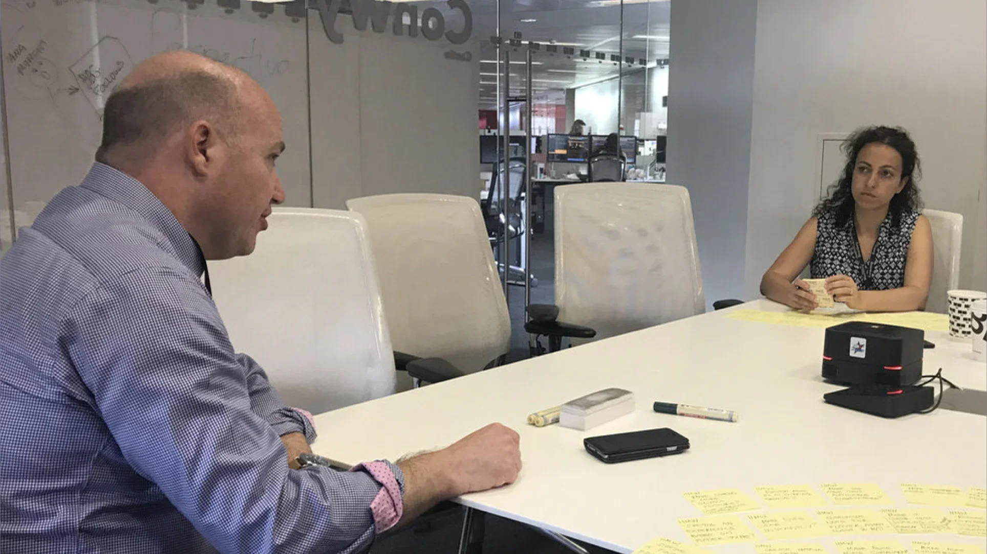
We stepped away from the legacy interface and spoke with twenty representative users about their needs and workflows. This helped us separate essential complexity from workarounds and historical residue. The goal was not to make SPDL merely look simpler, but to simplify the right things without weakening expert work.
Ideation: Transforming Research Into Cross-Functional Alignment
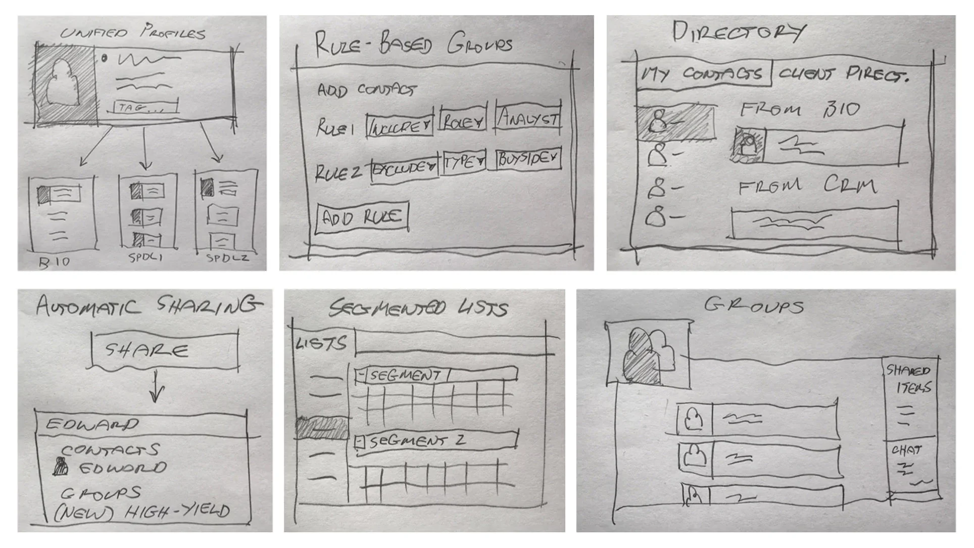
I brought Product, Sales, Engineering, and Design together to turn the research into possibilities. The workshop produced features, but its greater value was alignment: teams with different perspectives developed a shared understanding of the problems worth solving.
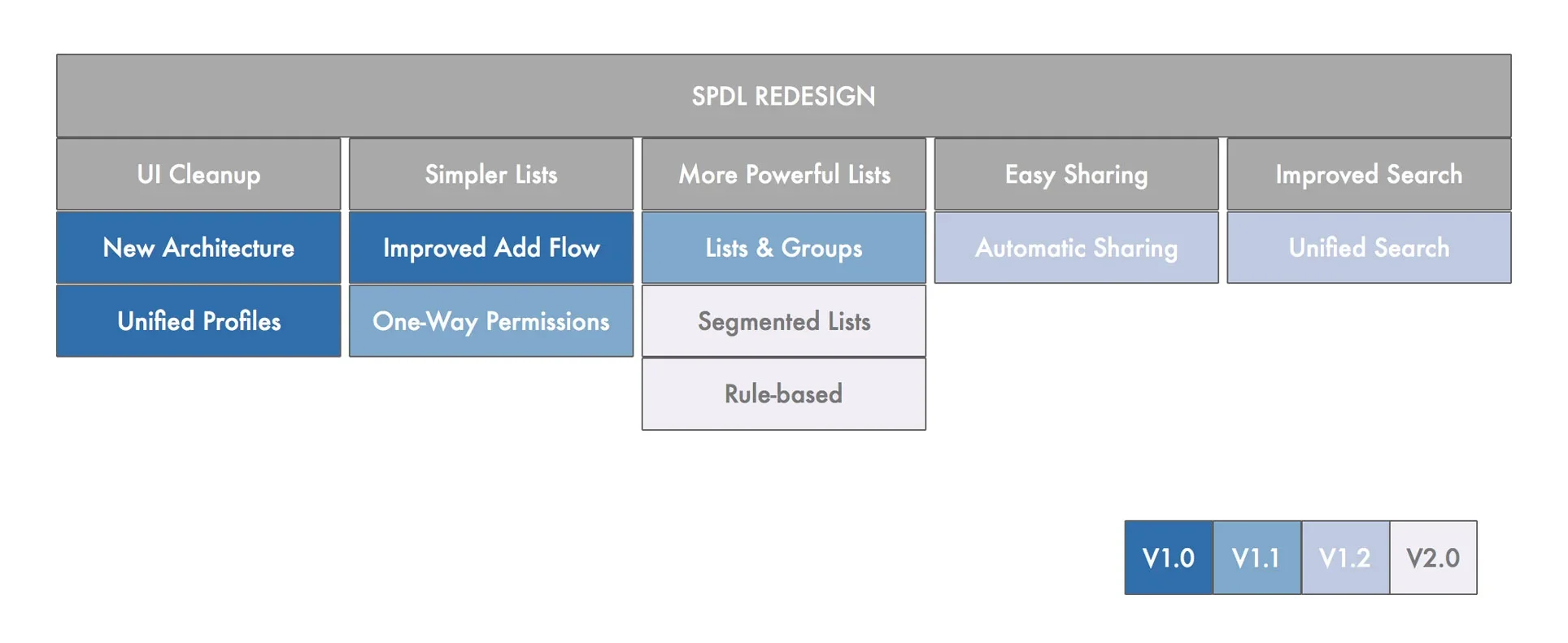
Prioritization: Shipping a Practical V1 Without Losing the Larger Direction
The concepts exceeded what one release could support. Working with Product and Engineering, we created a roadmap that balanced user value, technical dependencies, and delivery risk. We maintained two horizons: a shippable V1 and a longer-term direction, allowing pragmatic compromises without mistaking them for the final ambition.
Design: Organizing the Product Around Decisions, Not Legacy Features
V1 focused on views tied to specific decisions: finding a person, understanding a list, and seeing the context of a relationship. Organizing the redesign around user needs rather than the legacy feature inventory gave each view a clear purpose.
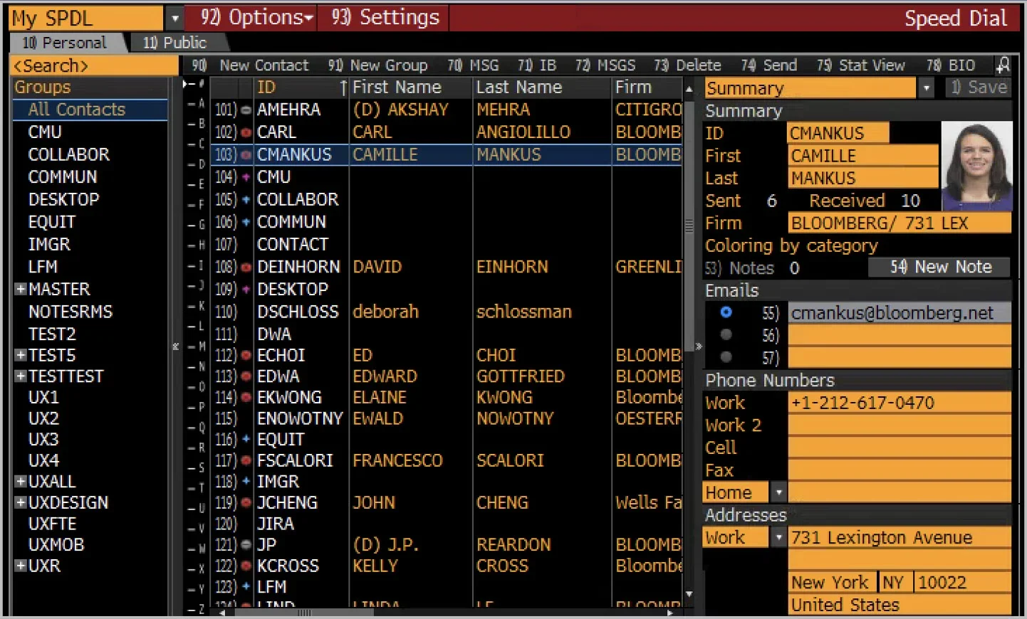
The Contacts View: Making Scanning Faster
User Needs
Find colleagues quickly and understand their online status.
After testing several approaches, a simple data grid proved strongest. It supported scanning, made status visible, and drew on patterns users already knew from Excel. Familiarity reduced effort; novelty would not have added value.
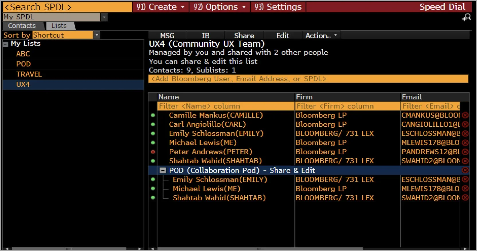
The List View: Exposing Context Before Users Act
User Needs
Understand which lists are available, where they came from, what they contain, and what actions are permitted.
The redesigned view brought provenance, contents, permissions, and actions forward so users could judge whether a list was appropriate before using it.
The Contact Detail View: Turning a Database Entry into a Decision Tool
User Needs
Understand the context of a relationship before contacting a colleague or client.
The detail view prioritized the identity, affiliation, history, and actions most relevant in the moment. It functioned as a decision surface rather than simply a database record.
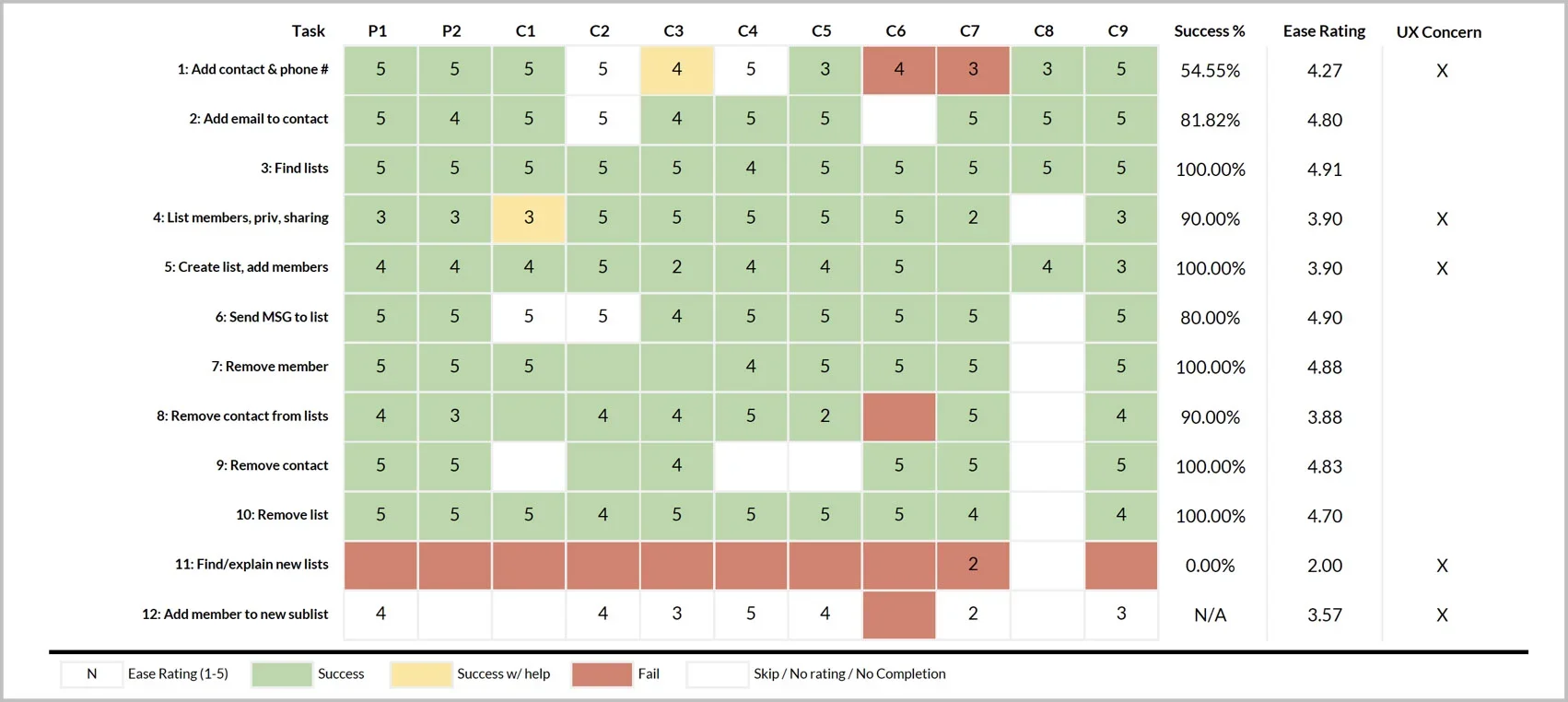
Usability Testing: Finding Hidden Confusion
We tested twelve critical tasks. Several showed high completion rates but still caused hesitation, incorrect interpretations, or recovery through trial and error. Completion alone would have hidden the confusion, so we refined workflows that were technically usable but not yet clear.
Refining the Design: Optimizing the Dominant Workflow
Following testing, we refined several critical workflows. The create-a-new-contact flow illustrates the kind of judgment the work required: choosing between imperfect alternatives based on how people were most likely to behave.
The Design As Tested: Two Fields Obscured the System’s Most Useful Shortcut
The form separated first and last names, but autosuggest worked only from the first-name field. Users who missed the suggestion continued through fields the system should have completed for them.
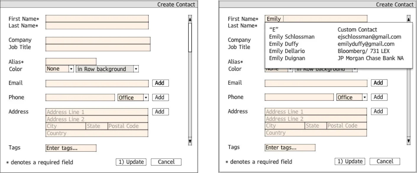
The Refined Design: How One UI Element Made the Expected Action Clearer
We replaced the two fields with one name field, making selection from autosuggest clearer and more reliable. Manual entry became slightly less precise, but most users selected existing contacts. We optimized the dominant workflow while preserving a workable exception.
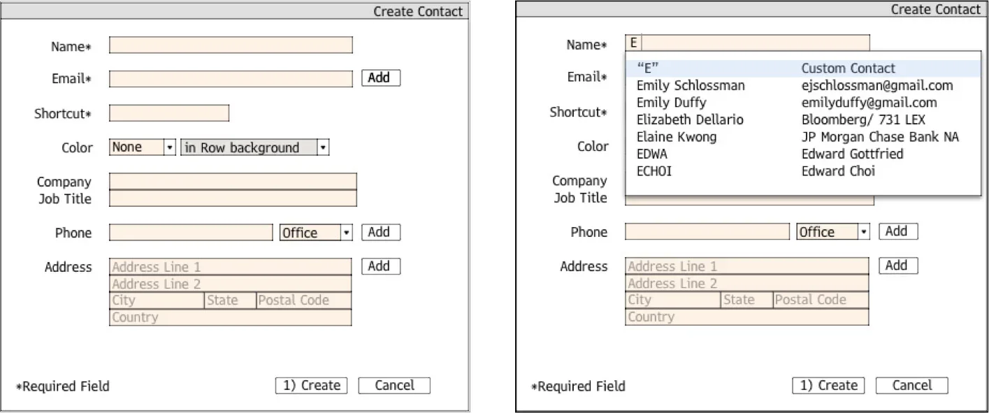
Impact: Users Strongly Preferred the Simpler Experience
In comparative testing, the redesigned experience increased NPS from approximately 65 for legacy SPDL to more than 80. The result validated the team’s central decisions: organize the application around users’ actual workflows, preserve familiarity where it supported speed, and remove complexity that no longer served a clear purpose. The redesign was subsequently shipped as the new Bloomberg Contacts experience.
Reflection: A Better Interface Began With Better Organizational Understanding
What I value most about this project is not any individual screen. It is that a multidisciplinary team untangled years of accumulated complexity, translated that understanding into a substantially better-performing experience, and brought it to market.
SPDL's complexity had not appeared because earlier teams lacked intelligence or care. It was the residue of years of useful responses to immediate needs. Making the application coherent again required us to understand the history without being governed by it, to respect expert behavior without preserving every workaround, and to balance a shippable first release with a direction that could endure.
The interface improved because the organization's understanding improved first. Research clarified the work. Cross-functional ideation created shared ownership. Prioritization turned ambition into a responsible sequence. Testing revealed where apparent success still concealed confusion. The resulting design was evidence of those decisions.
That remains central to how I lead design: human-centered work is not simply advocacy for users or the application of a process. It is the disciplined practice of helping organizations see the problem more clearly, confront tradeoffs honestly, and act with better judgment.