FLAVORPRINT
Redefining recipe discovery
Check out the Flavorprint case-study video
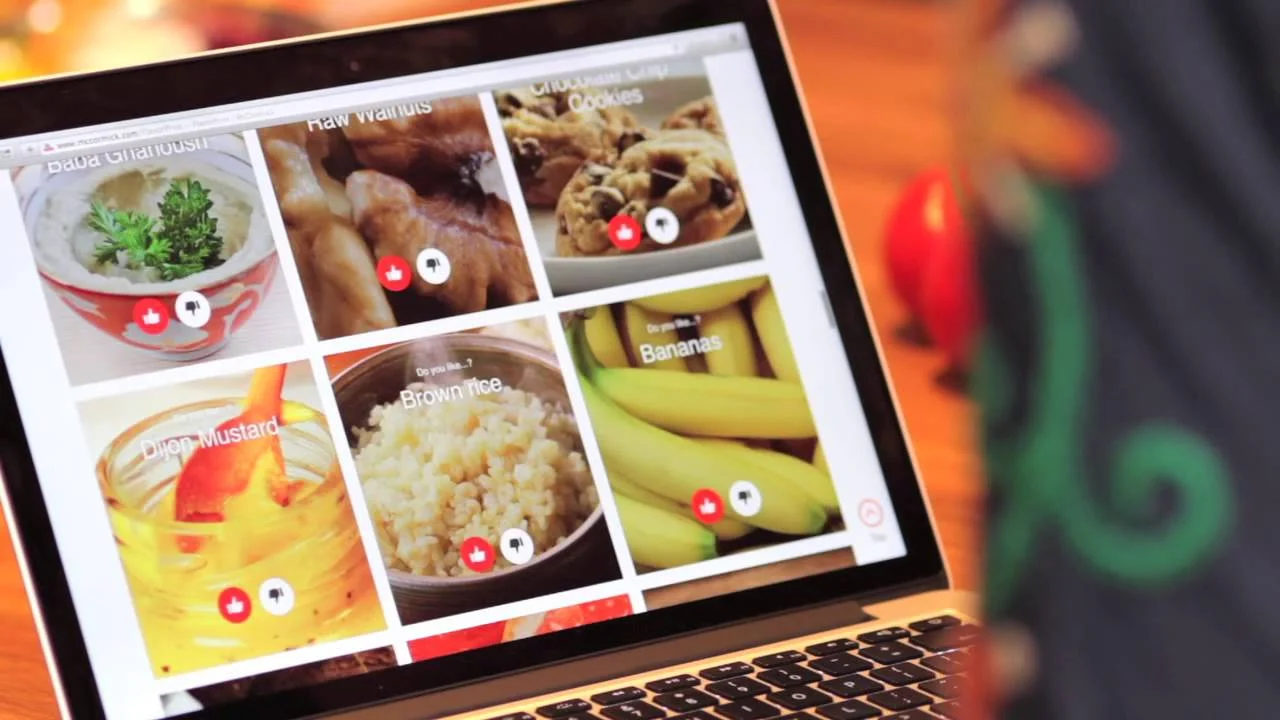
Approach: Start with a model dataset
The challenge to design a visualization system for flavors began with building a model dataset. To do this we consolidated the flavors identified by our food scientists (over 400) into 30 key categories. We then selected a sample of 100 recipes and used a closed coding process to code them with the 30 key flavors.
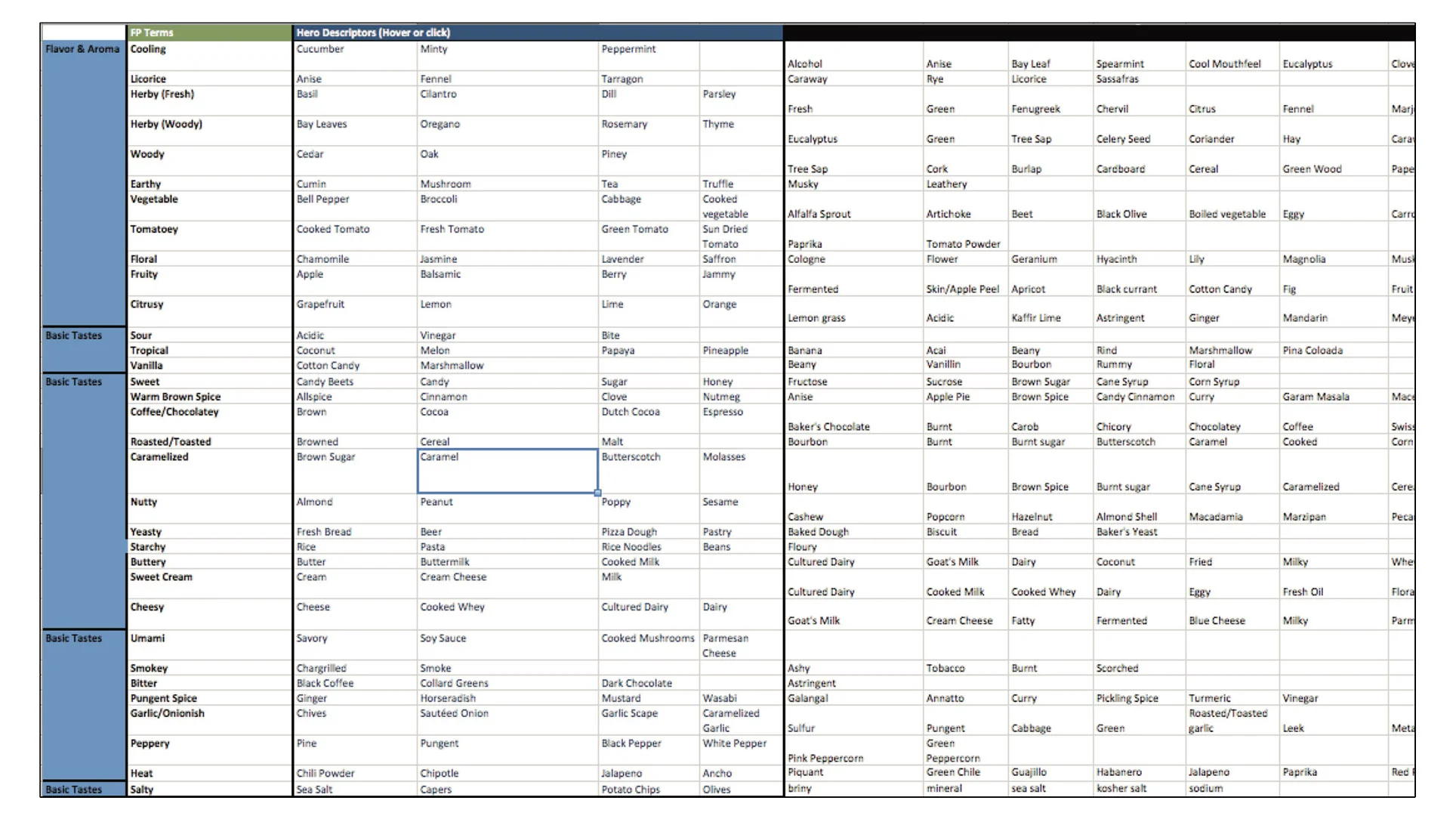
Colors
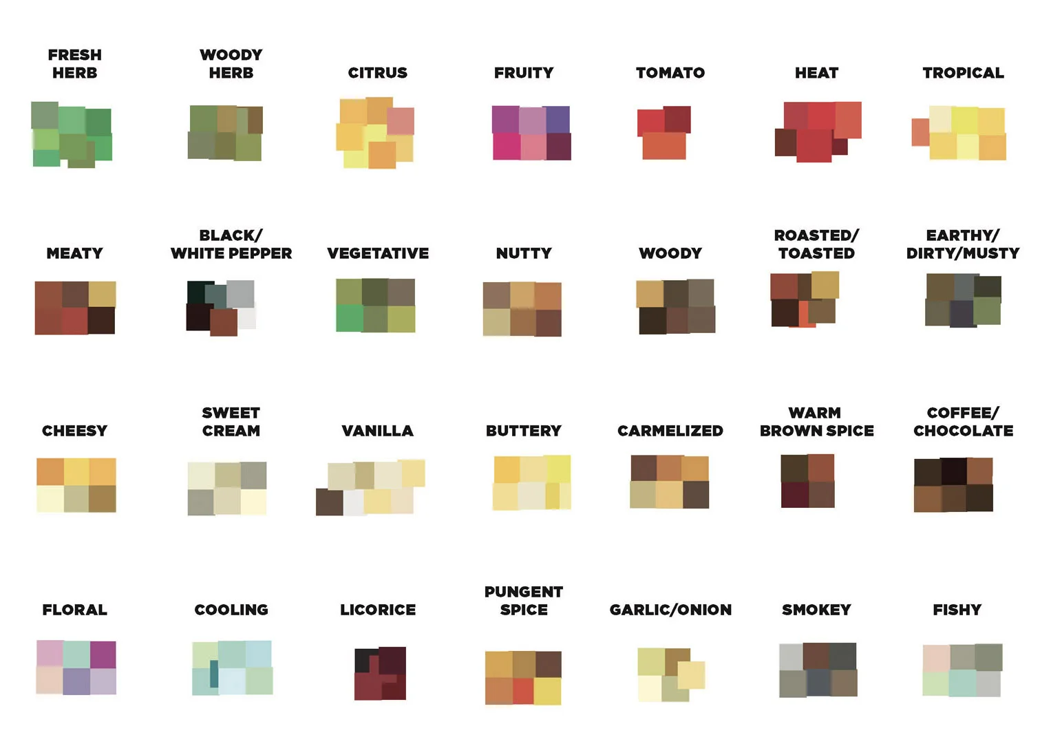
One of the first questions we asked was what colors to associate with each flavor. We identified a range of colors for each flavor and used a survey process to select the final choices. Below are the color ranges we identified.
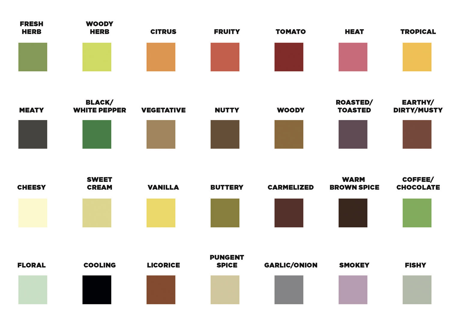
And the final colors selected after the survey.
Prototyping the visualization
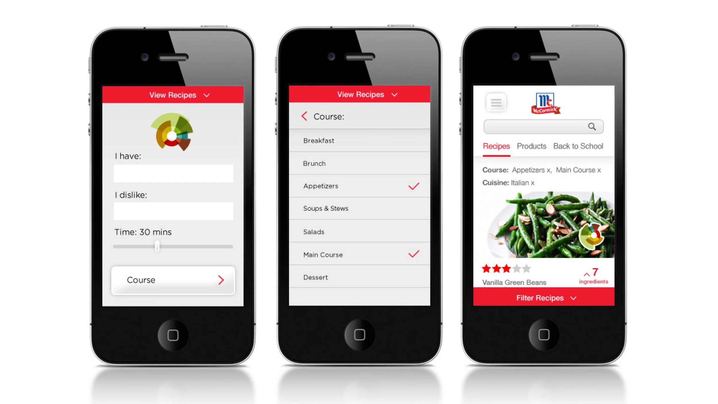
We knew that we wanted to use a sector graph (also known as a coxcomb diagram) as the core visualization. We knew we would use color and position to identify each flavor on the graph and the length of the sector to identify the intensity of the flavor. But many questions remained. How would the sectors scale? How big would the open space in the center be? How would the coxcomb render in various JS frameworks? We built a prototyping tool to explore these variations.

Rendering the model dataset
Using our prototyping tool and model dataset we began rendering large volumes of recipe visualizations to understand their legibility.
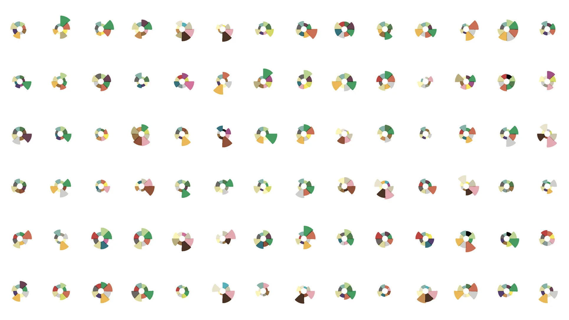
The right number of sectors
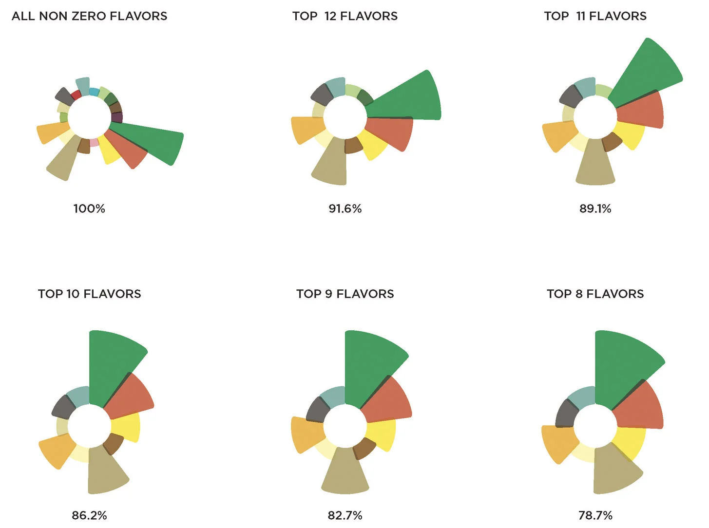
A key point of debate was how many flavors to render in the visualization. On the one hand, including all 30 possible flavors made the visualization too busy. On the other hand, our flavor scientists were uncomfortable creating a design that wasn't accurate or comprehensive. We analyzed the number of flavors per recipe and showed how the returns diminish as more sectors are added. In the end the team agreed that 9 sectors, covering more than 80% of the flavors in our recipes, would be acceptable.
Going beyond the visualization
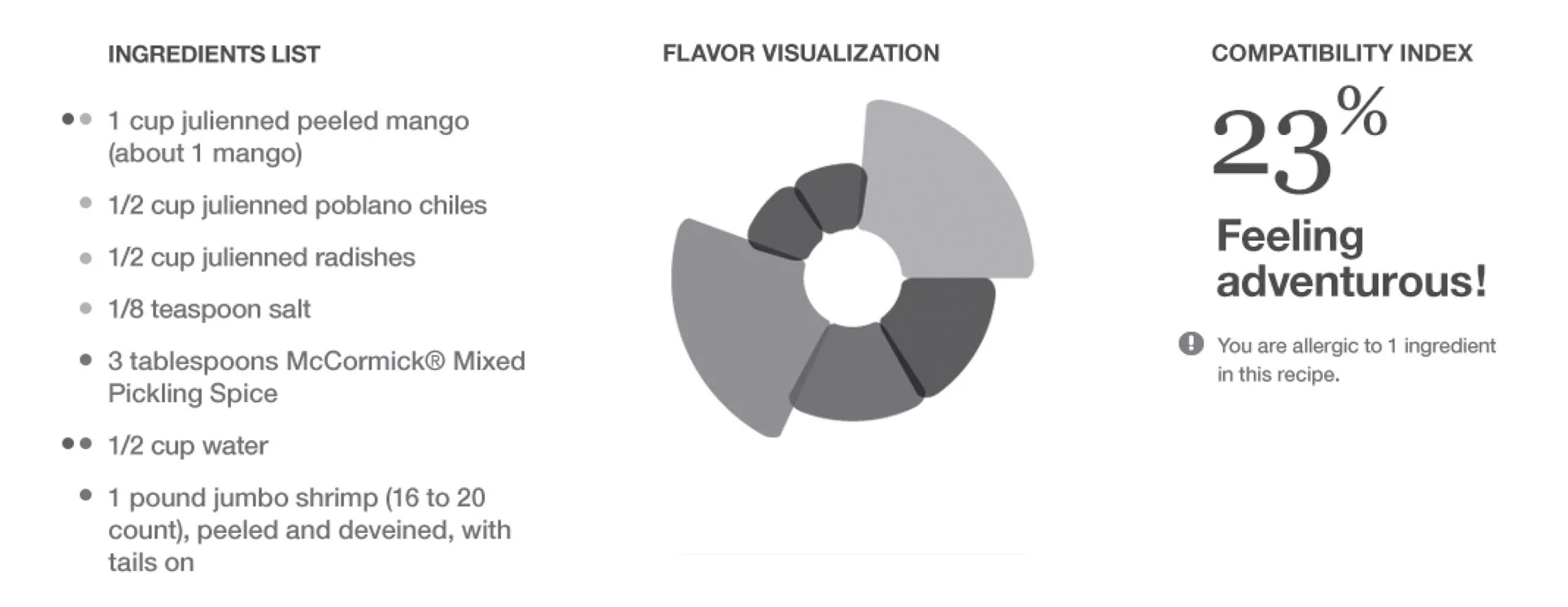
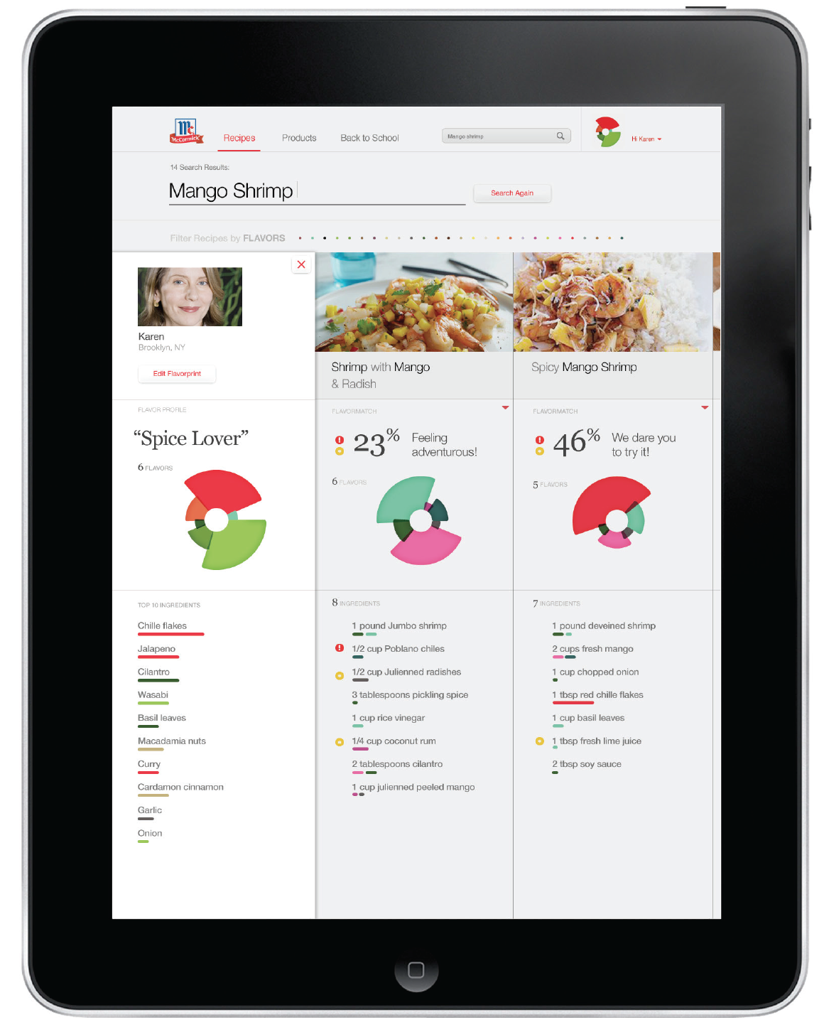
Testing found that while users valued the flavor visualization, it wasn't enough to help them make a decision about a recipe. We explored various options and found that a combination of the visualization, a list of ingredients, a percentage match, and a verbal phrase -- like "feeling adventurous!" -- made users feel much more comfortable about making a decision.